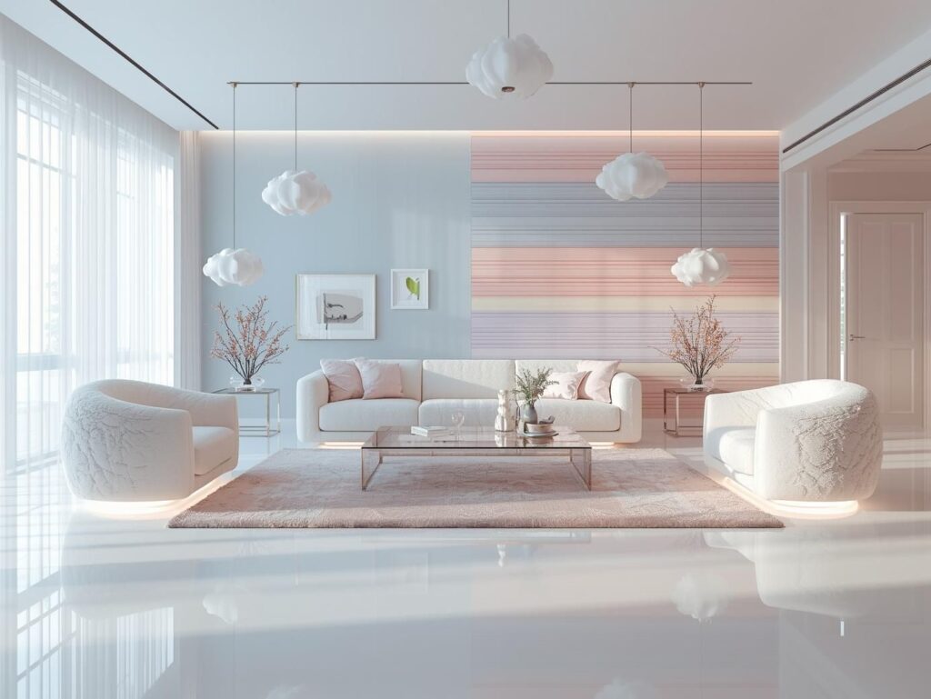
I still remember the first time I walked into a pastel living room that felt… flat.
Not ugly. Not messy. Just boring. Everything was soft walls, sofa, cushions, curtains. It looked like a Pinterest board that lost its personality in real life. That’s the tricky part of pastel living room decor. It’s beautiful, calming, and trendy but if you don’t add contrast, it can feel washed out, childish, or unfinished.
Let me walk you through how designers actually style pastel spaces so they feel sophisticated, layered, and visually rich.
Why Pastel Living Rooms Often Look Flat
Pastel colors are low-saturation shades like blush pink, mint green, powder blue, lavender, or soft peach.
They reflect a lot of light and have less pigment than bold colors, which makes them airy and calming.
But here’s the problem:
When everything is light and soft, your eyes struggle to find a focal point. Without contrast, the room loses depth, and your brain reads it as a single flat surface.
Interior designers fix this with contrast in three ways:
- Color contrast
- Texture contrast
- Lighting contrast
You don’t need to turn your pastel room into a dark space. You just need a few smart anchors.
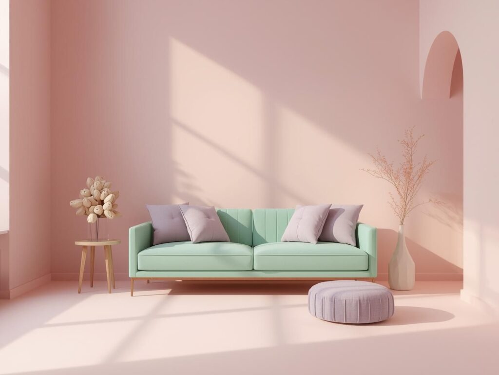
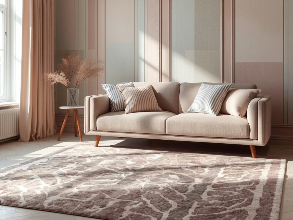
Use Dark Anchors to Ground Pastel Colors
Think of pastel decor like whipped cream. Delicious, but it needs cake underneath.
Black, Charcoal, and Deep Navy as Contrast Elements
You don’t need dark walls. Just small touches work wonders:
- Black picture frames
- Charcoal or navy room accent pillows
- A dark coffee table or metal legs on furniture
- Black floor lamps
Designers often use a 70–20–10 rule in pastel spaces:
- 70% light pastel tones
- 20% neutrals
- 10% dark anchors
That tiny 10% instantly makes the room feel structured.
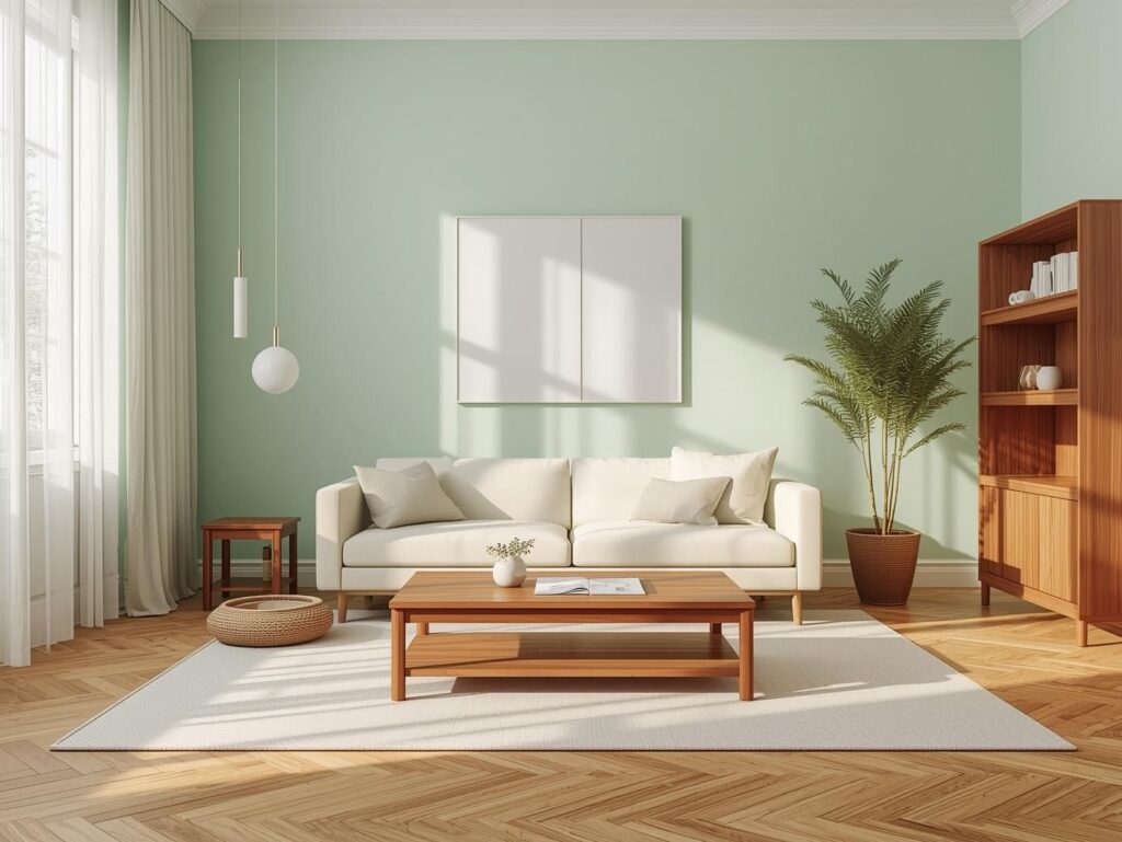
Wood Tones That Add Natural Depth
Wood is a secret weapon in pastel rooms.
Light woods (oak, birch) keep the space airy.
Medium woods (walnut, teak) add warmth and contrast.
Dark woods ground the softness without feeling harsh.
Wood grain also adds visual texture, which your eyes read as contrast even if the color is similar.
Layer Textures to Add Visual Weight
Here’s something most blogs don’t tell you:
Texture contrast is often more powerful than color contrast.
Soft Textiles vs Structured Materials
Pastel rooms often use soft materials: linen curtains, cotton cushions, boucle sofas. That’s great, but balance them with structured elements:
- Glass coffee tables
- Metal side tables
- Stone or marble decor
- Leather accent chairs
The mix of soft and hard materials creates a designer-level look.
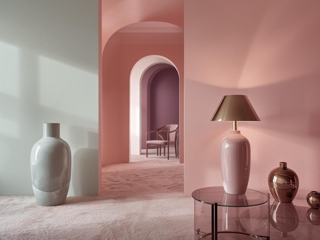
Matte vs Glossy Finishes
If everything is matte, the room looks dull.
If everything is glossy, it looks cheap.
Mix both:
- Matte walls + glossy vases
- Soft fabric sofa + shiny metal lamps
- Matte rugs + glass tables
Your eye loves the contrast between shine and softness.
Smart Color Pairings That Keep Pastels Interesting
Pastels don’t have to live alone.
Pastel + Jewel Tone Combinations
This is a designer trick that makes pastel rooms look expensive.
Examples:
- Blush pink + emerald green
- Mint green + deep navy
- Lavender + plum
- Powder blue + burgundy
Jewel tones increase the perceived saturation of pastels, so the soft colors feel richer instead of faded.
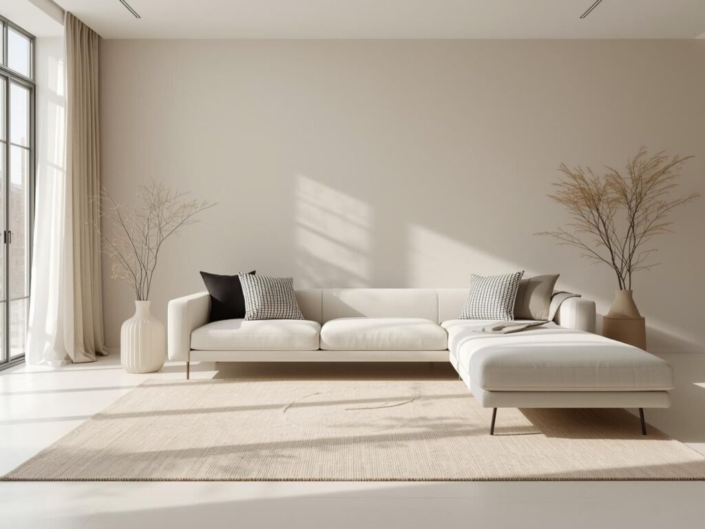
Neutral Contrast: White, Beige, and Greige
Neutrals can be powerful when used correctly.
Pair pastels with warm beige or greige to avoid a cold, hospital-like look.
A black and white rug, for example, adds instant graphic contrast without overwhelming the pastel palette.
Use Patterns and Lines to Create Depth
Patterns are contrasted without adding dark colors.
Geometric Patterns for Modern Contrast
Stripes, checks, terrazzo, and abstract geometric rugs add sharp lines that break the softness of pastels.
Even a subtle patterned wallpaper behind a sofa can change the entire room.
Organic Patterns for Soft Contrast
Florals, botanical prints, and organic shapes add contrast while keeping the room gentle.
This works beautifully if you love romantic or cozy interiors especially with decor like blue and white flowers in vases or artwork.
Lighting Tricks That Enhance Pastel Contrast
Lighting is a hidden design tool that most homeowners ignore.
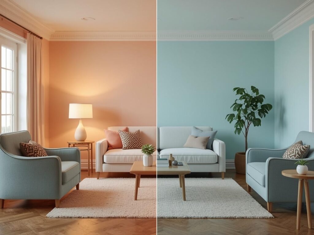
Warm vs Cool Lighting Effects on Pastel Colors
Warm light (2700K–3000K) makes pastels feel cozy and creamy.
Cool light (4000K+) makes them look washed out and sterile.
That’s why pastel rooms in showrooms look amazing—they use warm lighting.
Layered Lighting for Dimensionality
Use three layers:
- Ambient (ceiling lights)
- Task (floor lamps, table lamps)
- Accent (LED strips, spotlights on art)
Accent lighting creates shadows and highlights, which visually increases contrast even in light-colored rooms.
Focal Points That Stop Pastel Rooms From Feeling Bland
Every room needs a star.
Statement Furniture Pieces
In a pastel room, your sofa, accent chair, or coffee table can be the hero.
A velvet sofa in dusty blue, a sculptural chair, or a bold coffee table instantly creates contrast.
You can even pull inspiration from a blue room design and soften it with pastel accessories.
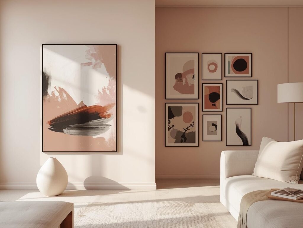
Art and Decor as Contrast Drivers
Large art with dark frames, sculptural decor, and bold ceramics work perfectly.
Gallery walls with black frames in pastel rooms look modern and intentional.
Common Mistakes
I see these mistakes all the time:
- Using only white and pastel (no anchors)
- Matching every cushion, curtain, and rug in the same pastel shade
- Ignoring scale (tiny decor in a big room looks flat)
- Too many soft fabrics without any structured materials
- Cold lighting that washes out colors
Avoid these, and your room already looks designer-styled.
Step-by-Step Formula to Style a Pastel Living Room With Contrast
Here’s a simple formula you can follow:
1. Start with a pastel base
Walls, sofa, or large rugs in soft tones.
2. Add neutrals
Beige, greige, or white furniture and decor for balance.
This connects well with broader Living Room Color & Palette Ideas across your site.
3. Add 10% dark contrast
Frames, lamps, tables, or pillows in black, charcoal, or navy.
4. Layer textures
Mix linen, velvet, wood, metal, and glass.
5. Use warm layered lighting
Ceiling lights + lamps + accent lights.
6. Create a focal point
Bold art, statement chair, or patterned rug.
Follow this, and your pastel living room will feel curated, not accidental.
Final Thoughts
Pastel living room decor doesn’t have to feel flat, childish, or boring. With the right contrast through color, texture, lighting, and focal points you can create a space that feels calm yet visually rich.
If you’re planning a makeover, start with one contrast element today: a dark frame, a patterned rug, or a statement lamp. Small changes make a massive difference.
FAQ About Pastel Living Room Decor
1. How do you make pastel living room decor look sophisticated instead of childish?
The key is contrast. Add dark anchors like black frames, navy cushions, or wood furniture. Mix textures like velvet, linen, metal, and glass. Sophisticated pastel rooms balance softness with structure.
2. What colors pair best with pastel living room decor?
Pastels work best with jewel tones (emerald, navy, plum), warm neutrals (beige, greige), and classic black and white. These combinations add depth and prevent the room from looking washed out.
3. Can dark furniture work in a pastel living room?
Yes, dark furniture actually makes pastels look richer. A dark wood coffee table, charcoal sofa legs, or a navy accent chair creates grounding contrast and makes the pastel palette feel intentional.
4. What lighting is best for pastel living rooms?
Warm lighting (2700K–3000K) is ideal. It enhances pastel tones and prevents them from looking pale or sterile. Layered lighting ceiling lights, lamps, and accent lights adds depth and visual interest.
5. How many pastel colors should you use in one living room?
Designers recommend 1–3 main pastel shades. Using too many soft colors can make the space feel chaotic and flat. Stick to a cohesive palette and add contrast with neutrals and dark accents.