It all started when I walked into a friend’s living room that felt… off. The walls were a soft green, the sofa a muted blue, and the rug was well, let’s just say the colors were having a quiet argument. The space wasn’t ugly, but it didn’t feel like home either. That’s when it hit me: the right color palette can change everything. Colors aren’t just decoration they set the mood, create energy, and can even make a room feel bigger or cozier. Choosing a palette that actually works together can transform your living room from a random collection of furniture and paint into a sanctuary that reflects your personality. And the good news? You don’t need a designer or a huge budget to get it right. Let me take you on a journey through some Living Room Color & Palette Ideas that I’ve seen work wonders, complete with real-life stories, tips, and little secrets that make each combination sing.
- Blue Living Room Decor Ideas
- Navy Living Room Decor Ideas
- Grey and Beige Living Room Decor Ideas
- Blue and Brown Living Room Decor
- Black and White Living Room Wall Decor
- Decorating Ideas with Blue and White Flowers for Living Room
- Teal, Blue, White, and Gold Decorating Ideas for Living Room
- White, Yellow, and Navy Blue Living Room Decorating Ideas
- Blush Pink Living Room Decor
- Pastel Living Room Decor
- Earthy Tones for a Cozy Living Room
- Green and Natural Living Room Decor
- Bold and Vibrant Color Pairings
- Seasonal Color Updates on a Budget
- How to Decide What Color Works Best on a Low Budget
- Affordable Tips for Making Any Palette Work
- Conclusion
Blue Living Room Decor Ideas
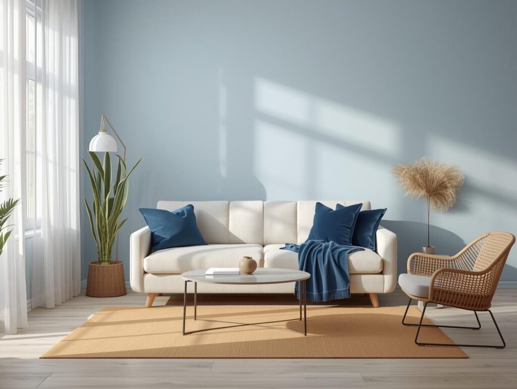
Blue living room has a quiet magic. I remember a couple who had just moved into a small city apartment. They loved blue, but the living room felt cramped. We chose a soft sky-blue for the walls, paired with a cream sofa and a rug in sandy beige. The moment the paint went up, the room felt lighter, calmer, like a gentle morning breeze had floated in.
Later, we added sapphire blue cushions and a velvet throw. The deep accent color gave the room depth, and suddenly the space wasn’t just calm it was sophisticated. Blue reminds us of the sky and sea, bringing tranquility and balance to a living room.
Lesson Learned: Light blues make spaces feel larger. Dark blues add drama. And layering both? Magic.
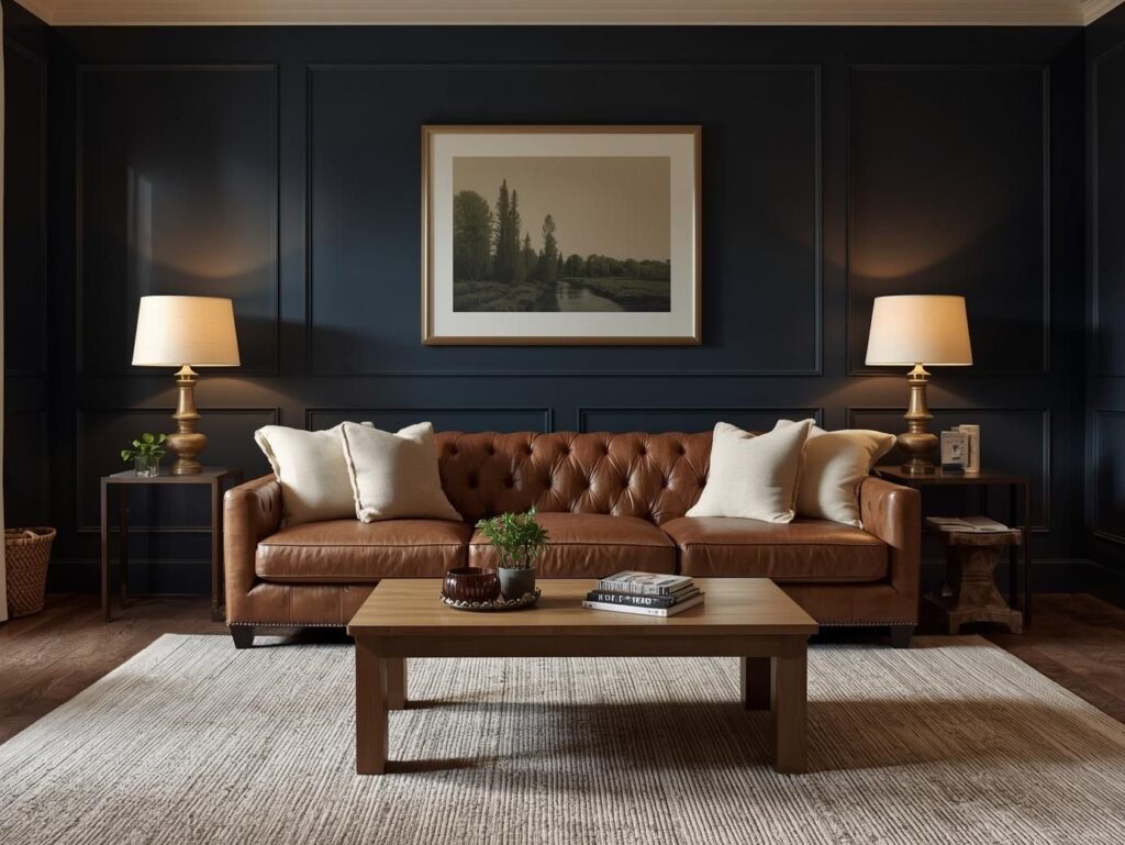
Navy Living Room Decor Ideas
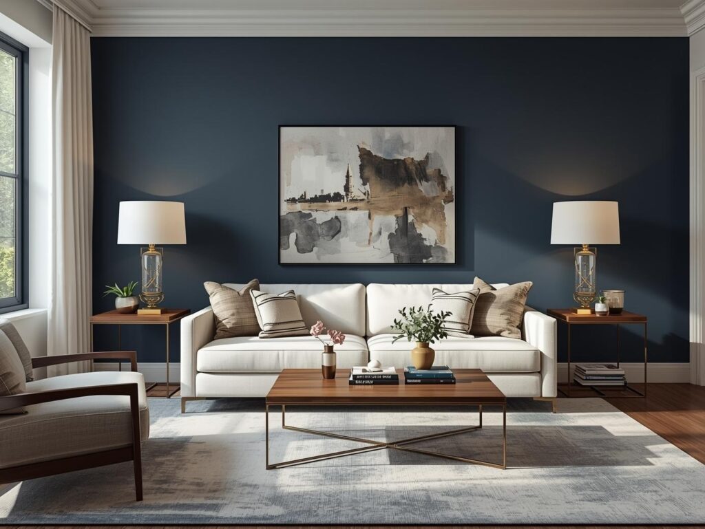
The Navy is bold. I still remember a living room where the homeowners were terrified of using it. It felt too dark. But when we painted one wall navy and contrasted it with a white sofa, the effect was like stepping into a designer’s magazine. The navy created a cocoon of elegance, while the white kept it airy.
Adding a few brass lamps and a wooden coffee table softened the darkness and added warmth. Suddenly, the room wasn’t intimidating, it was inviting and stylish.
Pro Tip: You don’t need to go full-on navy. Even one wall, or a few furniture pieces, can transform the mood completely.
Grey and Beige Living Room Decor Ideas

Grey and beige are like best friends: reliable, supportive, and endlessly flexible. The living room I helped redesign felt cold and uninviting because it was all grey. Introducing beige furniture and soft pastel cushions changed everything the room seemed to sigh with warmth.
Mixing textures—velvet, wool, linen—made the neutral palette feel layered and cozy. You could swap accent colors seasonally without ever repainting. Grey and beige are subtle but allow your personality to shine through in accessories.
Story Tip: Neutrals are your playground. Start with them, and let smaller items tell the story.
Blue and Brown Living Room Decor
Blue and brown might sound unconventional, but they’re like peanut butter and chocolate: surprisingly perfect together. A friend once wanted a “grown-up” living room, and we paired deep navy walls with a worn brown leather sofa. The first time she walked in, she smiled. The colors felt grounded, comforting, and elegant.
We added cream cushions and a soft rug to soften the contrast. Blue gave depth, brown brought warmth, and cream kept everything balanced. This palette works whether you want modern sophistication or a cozy, lived-in feel.
Pro Tip: Use natural elements—wood, woven baskets—to enhance the harmony of blue and brown.
Black and White Living Room Wall Decor

Black and white is a story of contrasts. I remember advising a client with a long, narrow living room. Painting one wall black made it feel like the room had depth and character. White furniture and curtains brightened the space, while black accents picture frames, a rug added sophistication.
Patterns, stripes, geometrics, abstract art brought life and personality. Black and white isn’t cold; it’s a canvas for your creativity. Even a small touch, like a monochrome rug or a bold lamp, can dramatically change a room’s energy.
Decorating Ideas with Blue and White Flowers for Living Room
There’s something magical about flowers indoors. Blue and white floral patterns, in particular, can breathe life into a space. A client of mine had a rather plain living room. Adding floral cushions, a small patterned rug, and a matching vase arrangement transformed it instantly. The space felt fresh, airy, and happy without being overwhelming.
Tip: Start with small accents. Even a single floral pillow can become the hero of your living room story.
Teal, Blue, White, and Gold Decorating Ideas for Living Room
Teal feels bold but soothing at the same time. When paired with white and gold, it becomes a palette of elegance. I helped a family who wanted a luxe feel without being over the top. A teal sofa, white walls, and subtle gold accents in mirrors and lamps gave the room a jewel-like quality.
It didn’t feel cold or distant because we layered textures, soft throws, velvet cushions, and a plush rug. Teal, white, and gold together create a space that is lively, elegant, and entirely approachable.
Budget Tip: Gold doesn’t have to be expensive. Frames, vases, or spray-painted items can mimic luxury at a fraction of the cost.
White, Yellow, and Navy Blue Living Room Decorating Ideas
I’ll never forget the family who wanted “cheerfulness without chaos.” We chose white walls, navy blue furniture, and yellow accents. The white gave brightness, the navy grounded the space, and yellow threw in playful pops of energy.
Adding wooden elements and greenery made the room feel natural and balanced. That living room became a space where kids could play, guests could relax, and the family felt instantly at home.
Story Tip: Yellow is easy to swap seasonally. Cushions, throws, or a vase are all it takes to refresh a room.
Blush Pink Living Room Decor

Blush pink is soft, romantic, and unexpectedly versatile. A client once wanted her living room to feel “gentle but grown-up.” We added blush pink cushions, a feature wall, and paired them with grey and metallic accents. The result? Cozy, elegant, and welcoming.
Balance is key. Pair blush with deeper colors like charcoal or navy to avoid a too-sweet effect. Textures, again, play a huge role velvet, linen, or wool help make pink feel sophisticated.
Tip: Even on a budget, blush can work. Cushions, small rugs, or artwork can introduce the color without a full renovation.
Pastel Living Room Decor

I still remember walking into a living room that felt… almost ethereal. The walls were a soft mint green, the sofa a delicate blush pink, and cushions in pale lavender and sky blue were scattered across it. There was something magical about the room; it felt like stepping into a dream, a place where time slowed and the chaos of the outside world melted away. That’s the power of pastels.
Pastel colors, soft pinks, mint greens, baby blues, lavender, and buttery yellows are gentle on the eyes and naturally calming. They create spaces that feel open, airy, and inviting, which is why they’re a favorite in living rooms that aim to be relaxing sanctuaries. Unlike bold or saturated colors, pastels don’t demand attention; they whisper, rather than shout. This makes them perfect for rooms that need to feel spacious, balanced, and cohesive.
In essence, a pastel living room is a sanctuary in color form. It’s soft, welcoming, and serene, yet endlessly adaptable. Whether you layer different pastel tones or combine them with neutrals for a subtle contrast, the effect is always calming, stylish, and effortlessly chic in a space that makes you want to linger, relax, and truly feel at home.
Earthy Tones for a Cozy Living Room
Earthy tones like terracotta, olive, and warm browns make a room feel grounded and cozy. A friend’s urban apartment was transformed by olive green walls, a terracotta rug, and wooden furniture. The space felt like a retreat from the city’s hustle.
ProTip: Layer textures—wool throws, jute rugs, and linen cushions—to amplify warmth.
Green and Natural Living Room Decor
Greens bring nature indoors. A sage-green wall, paired with wooden furniture and indoor plants, transformed a city apartment into a mini oasis. The living room felt calm, refreshing, and balanced.
ProTip: Plants not only look good—they complement green palettes and improve the room’s ambiance.
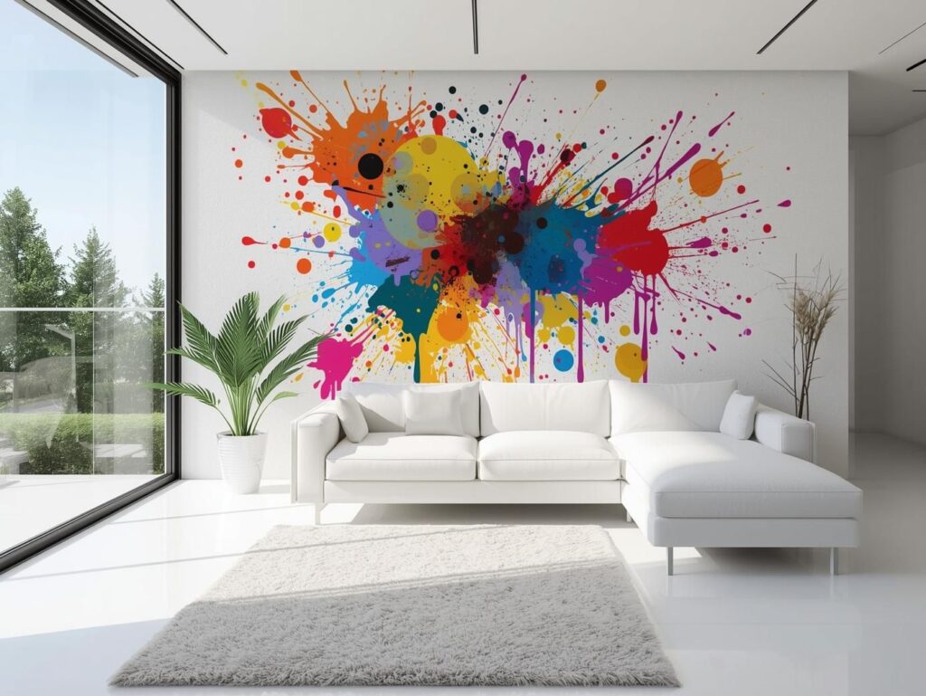
Bold and Vibrant Color Pairings
Bold pairings—mustard + teal, coral + navy—bring energy and personality. A friend’s living room felt lifeless until we added a coral rug and mustard cushions on a neutral sofa. The colors danced together, making the room feel alive.
ProTip: Stick to small accents if you’re nervous about bright colors—they pack a punch without overwhelming the space.
Seasonal Color Updates on a Budget
Small seasonal changes—pillows, throws, vases—keep a room fresh without repainting or buying new furniture. Switching blues for yellows in summer, or blush for burnt orange in autumn, keeps the living room lively year-round.
How to Decide What Color Works Best on a Low Budget
Picking a palette on a budget is like planning a story. You need a main character (dominant color), supporting characters (secondary colors), and small highlights (accents). Start by imagining the mood you want: calm, cozy, cheerful, or dramatic.
Test colors with swatches or small samples. Adjust based on lighting morning sun, afternoon glow, or artificial lights can change everything. And start small: a single wall, a few cushions, or a rug can test your palette without breaking the bank.
Budget Tip: Mix old and new. Use what you already own and integrate inexpensive accents to tell your living room story.
Affordable Tips for Making Any Palette Work
- Layer Textures: Velvet, linen, wool—mixing textures adds richness even on a budget.
- Accent Pieces: Pillows, throws, vases, or lamps can dramatically shift the palette.
- Lighting Matters: Natural light can make colors pop or fade. Test at different times.
- Start Small: Experiment with one element before committing to a full redesign.
Conclusion
Colors tell stories. Every living room has the potential to feel like a sanctuary if you understand how to weave colors, textures, and light into a cohesive narrative. From soft blues that whisper calm, to navy that commands attention, blush pink that soothes, or yellow that energizes, your palette shapes how your living room feels every day.
The best part? You don’t need a huge budget or a professional designer. Thoughtful choices, small accents, and a bit of storytelling magic can turn any living room into a space that feels truly like home.