The Navy has a way of stopping people mid-sentence. You walk into a living room wrapped in navy and instantly feel grounded, calm, collected, a little dramatic in the best way. But here’s the part most guides skip: navy only works when light and depth are in conversation with each other. Too much depth, and the room feels heavy. Too much light, and the navy loses its richness. The sweet spot lives right in between. These navy living room decor ideas that balance light and depth aren’t pulled from showrooms or overly styled spaces. They’re based on how real homes behave, changing light, daily use, and furniture that actually gets sat on. Let’s walk through it step by step, the same way a designer would build the room from the ground up.
Start With Where Navy Belongs
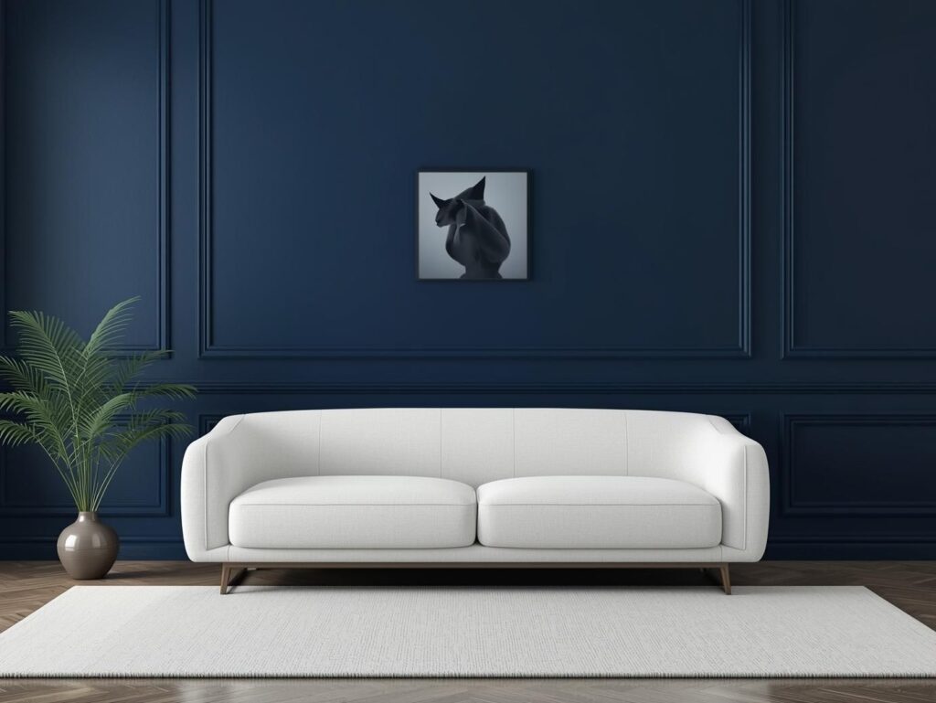
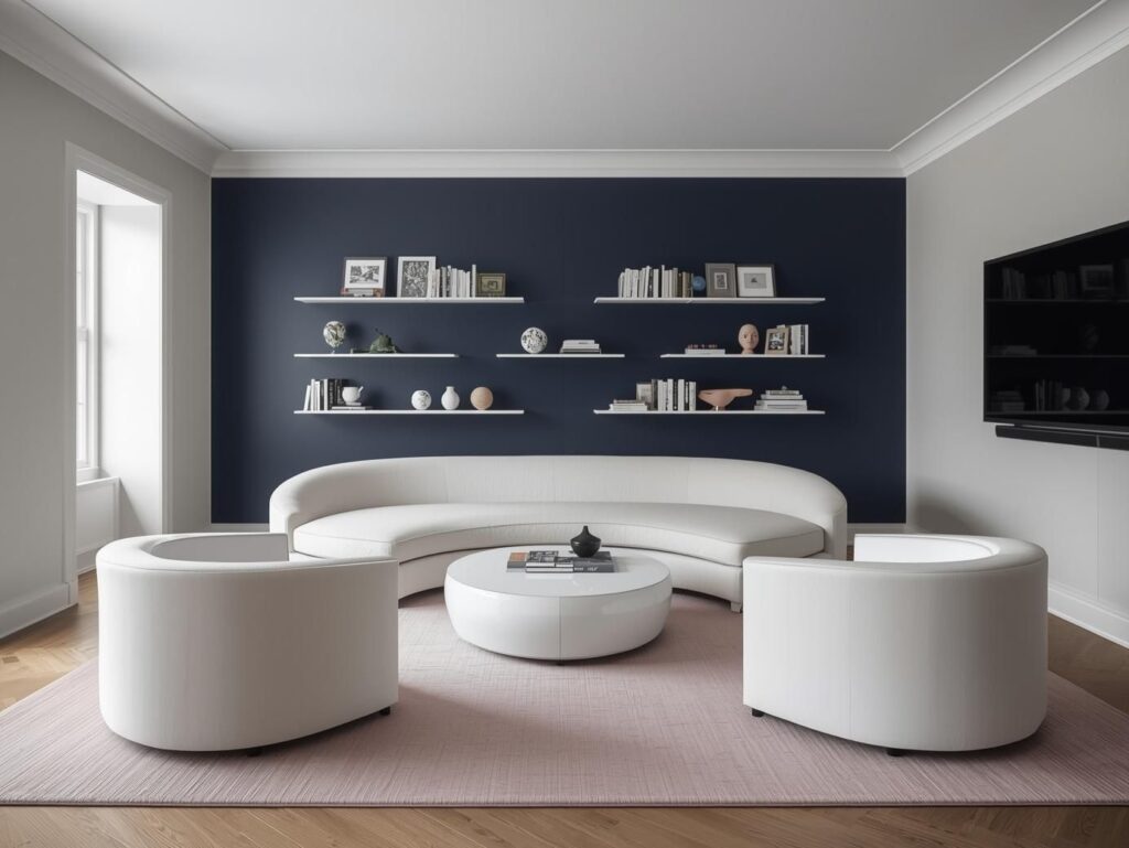
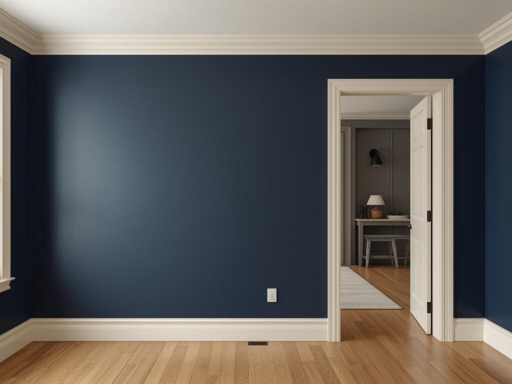
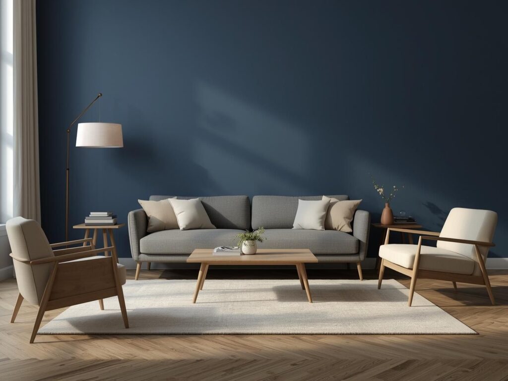
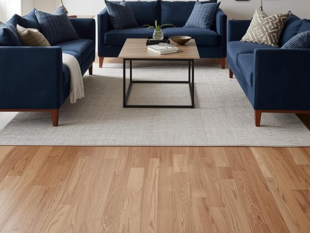
The mistake most people make is spreading navy everywhere pillows, walls, curtains, rugs until the room feels visually crowded. The Navy works best when it’s anchored. In one home I worked on, the navy lived only on the sofa. Everything else stayed quiet. That single decision gave the room instant depth without making it dark. In another space, navy walls worked beautifully but only because the rest of the room knew how to support them.
Pick one main navy anchor:
- A navy sofa
- A navy accent wall
- Navy built-ins or cabinetry
- A large navy area rug
Once the navy has a clear home, the rest of the room can focus on lightening and balancing it. This is how you avoid that “why does this feel heavy?” moment.
Add Light Before Adding Decor
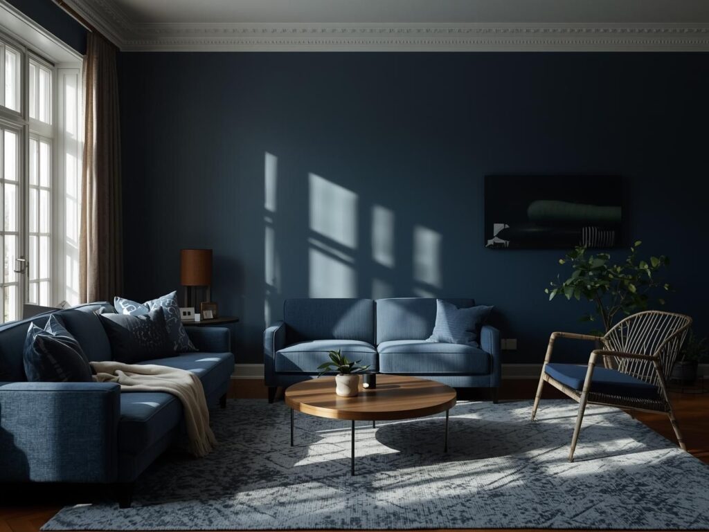
Before you buy a single cushion or artwork, pause and look at how light actually enters your room. The Navy reacts differently depending on exposure.
A south-facing living room can handle deeper navy because sunlight softens it throughout the day. A north-facing room needs lighter finishes, reflective surfaces, and warmer tones to keep navy from feeling flat.
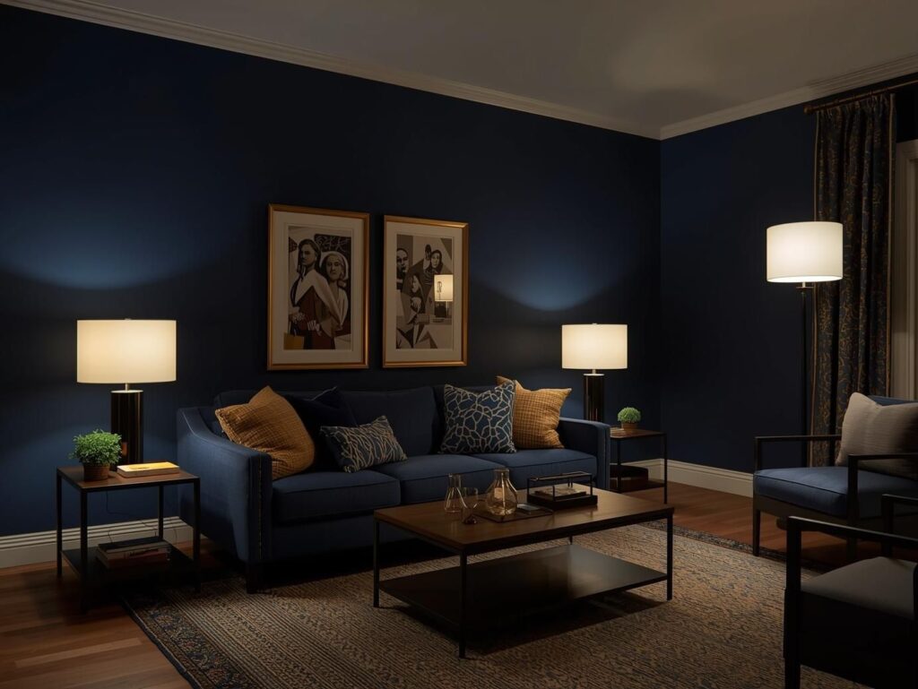
Designers often treat navy like they would in a blue room used for evenings: layered lighting, lighter ceilings, and intentional contrast. The key is this order: light first, decor second. If the light works, everything else becomes easier.
Use White, But Not Flat White
Pure white next to navy can feel sharp, even cold. That contrast may look striking online, but in real homes it often feels unfinished.
Instead, reach for:
- Soft whites with a warm undertone
- Creamy ceiling paint
- Off-white trims that glow rather than glare
This subtle warmth lifts the navy without diluting it. Think of it as a quiet buffer zone between light and depth. If you love high contrast, black and white walls can still work but navy should sit slightly apart from that pairing so it doesn’t compete for attention.
Balance Navy With One Soft Neutral
The Navy needs a partner, not a crowd. One neutral is enough to stabilize it.
A grey sofa with a warm undertone, light beige walls, or soft greige textiles can keep navy grounded without making the room dull. The trick is that cool greys can fight navy, while warmer ones blend smoothly.
In several homes, pairing navy with a restrained grey and beige mix created rooms that felt calm instead of dramatic. The navy added depth; the neutral carried the light.
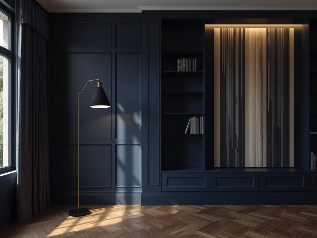
Let Texture Do the Heavy Lifting
When light is limited, texture becomes your best tool.
Instead of brightening the room with more color, layer in:
- Linen or cotton curtains
- Wool or flat-weave rugs
- Soft throws
- Wood furniture with visible grain
- Matte ceramics instead of glossy ones
Texture catches light in tiny ways, adding movement even when the color palette stays quiet. This is how navy rooms feel cozy instead of flat. It’s also why navy works so well in homes that lean toward blue and brown combinations wood naturally softens the depth.
Break Up Dark Areas With Height
The Navy tends to settle visually at eye level. If everything dark sits low, the room feels compressed.
You can fix this by pulling the eye upward:
- Tall floor lamps
- Vertical artwork
- Floating shelves
- Full-length curtains mounted high
Even a slim shelf with light objects can change how the navy reads in space. The room feels taller, lighter, and more intentional without adding more color.
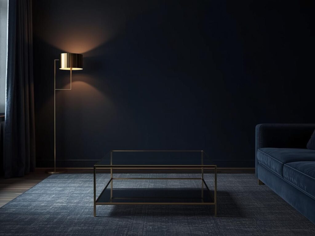
Use Metal and Glass as Light Tools
Think of metal and glass as quiet reflectors.
Brushed brass, aged gold, or even soft chrome bounce light without stealing focus. A glass coffee table or lamp base keeps sightlines open, which is especially helpful in navy-heavy rooms.
In modern spaces, these elements prevent the navy from feeling traditional or dated. They also bridge the gap between depth and brightness effortlessly.
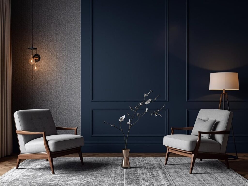
Keep Furniture Legs and Bases Light
Heavy furniture sitting directly on the floor adds visual weight. The Navy already carries depth, so your furniture should help lift it.
Look for:
- Sofas with exposed legs
- Chairs with metal frames
- Light wood bases
- Open shelving instead of closed cabinets
This small detail changes everything. The room breathes more, and the navy feels intentional instead of overpowering.
Layer Lighting, Don’t Rely on One Source
Overhead lighting alone will flatten the navy every time.
You need layers:
- Ambient light (ceiling or recessed)
- Task lighting (reading lamps)
- Accent lighting (table lamps, picture lights)
Warm bulbs are essential. Cool lighting makes the navy feel stark. When layered correctly, the room glows in the evening the moment the navy looks its best.
Add Art That Creates Space, Not Noise
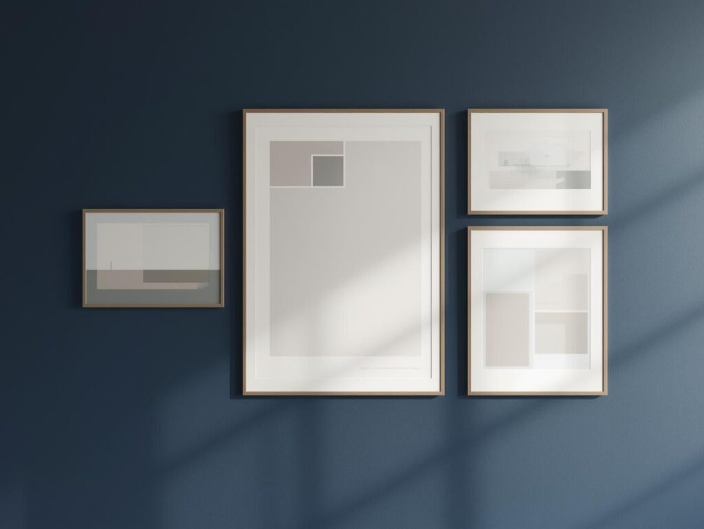
Artwork in a navy living room should open the space, not close it in.
Look for:
- Light backgrounds
- Negative space
- Simple frames
- Subtle color echoes
Busy, dark art stacked on navy walls compresses the room visually. Lighter pieces create breathing room and draw the eye outward.
Finish With One Soft Color Accent
The Navy doesn’t need competition. One gentle accent is enough.
This could be:
- Muted blue
- Soft wood tones
- A hint of warmth inspired by a pastel living room
- Natural fibers or ceramics
The goal isn’t to contrast it’s harmony. When done right, the navy becomes the anchor that lets every other element feel intentional.
Final Thought
Navy living rooms succeed when they’re built slowly and thoughtfully. Depth comes from restraint. Light comes from layering. And balance comes from knowing when to stop.
If you’re exploring broader Living Room Color & Palette Ideas, think of navy as your foundation color, the one that grounds the room while letting everything else shine. When light and depth work together, the navy doesn’t feel dark at all. It feels timeless.